
As those of you who have met me in person might know, I have a rather unique Origami business card. When folded, the card is the same size as a regular business card. However, by pulling on two of the corners of the card it can be made to expand, becoming as large as a post card. When closed the card has normal contact information information, when opened the card has a description of my research interests and callouts to some of my past papers.
The point of this post is to serve as a postmortem reflection for the most recent iteration of my business card design (version 2.1). I plan on discussing some background on the 1.0 iteration of the card, my design goals for the 2.x series, what changes I made to achieve these goals, and my evaluation of the card in both in the lab, and real world settings.
Background
Ive been doing Origami all my life. One type of design that has always fascinated me is designs that expand and contract, changing their size when used. Jeremy Shafer's Flasher is a great example of this, packing the paper quite small, and expanding quite large when pulled open. I thought it would be cool to design a business card that had this feature, starting small and expanding to a much larger size, all while folding flat.
After a few years trying off and on to discover a good design I found that a simple twist fold could be used for the purpose. This led to the 2012 version (version 1.0) of my business card. This is where I worked out many of the technical problems of the design. Since this post isn't really about the 1.0 card Ill cover these technical problems briefly:

Size and dimensions
While the mechanism of the design itself is relatively simple, it took some work to figure out exactly what size to make it. After some trail, error, and math I was able to get the expanding area as large as possible for a 3.143 (almost pi!) times increase in surface area when opened. After that I mocked the design up in inkscape to allow the design to fit the contours of the fold, which beyond making it look nice, made it easier to fold the same way with respect to the design.
Paper thickness
Normal printer paper (20 lb) consistently felt a little too thin, and a little too cheap (most people know printer paper when they feel it). Unfortunately if I step up to the thickness normally used in a business card the paper becomes too thick to fold cleanly and the creases look ugly. I ended up settling on a slightly thicker 24 lb paper. Its a subtle effect, but the thicker paper gave the finished card a little more substance.
Printing technology
At a micro level folding paper actually tears fibers along the fold. With most printing techniques (like ink-jet) this is fine since the coloring permeates multiple layers of the paper. However with laser printing, which works by applying a layer of ink over the paper, this can be an issue and white lines can appear where the fold breaks the surface layer of ink. Unfortunately laser printing is the dominant technique for bulk color printing. Therefore it is important, especially with laser printing, to avoid putting content directly over a fold. For the 1.0 version I used a home ink-jet printer, for 2.0 I traded up to professional laser printing, which was enough of a reduction in cost and effort to warrant the extra care needed in the design phase.
2.0 Design goals
The 1.0 card solved most of the functional goals for the design, it has two states, expands considerably, and looks like a business card when closed. Unfortunately, the 1.0 design had several problems that contributed to a major design overhaul when redesigning the card for a 2.0 release.
The following are my major goals for the 2.0 release of the card.
-
People open the card - The 1.0 design was very good at looking like a normal card when closed. It was too good, actually. Without prompting, almost nobody noticed that the card was also origami and that it could be opened. While I don't want the card to look bad or incomplete when closed, I want anyone who actually looks at the card to be able to recognize that this is an origami artifact that can be manipulated.
-
People can open the card - Its not actually complicated to open the card (pull on opposite corners), but there are plenty of bad ways of doing it. I wanted the new design to be much more obvious about how to open it, not just that it could be opened. Ideally I don't want to have to give anyone instructions about how to open or close the card instead I want to see people opening the card all on their own.
-
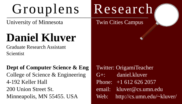
Information - Just like last time, I wanted to get my full contact information on the closed card. I also wanted to get information about my past papers onto the card to give people an idea about what sort of work Ive done, as well as a more general personal research statement. Ideally I want the card to be able to stand alone and be enough that someone who doesn't know me might be able to look at it and know what I do.
-
Impact - I want a business card that people look at and think "this is cool", something that people make a point to keep and look at again later. Ideally I want something that people might tell others about and maybe advise their friends to get one too.
Improvements
This blog post actually skips the 2.0 version of the card. The 2.0 version was a short-lived iteration with a different layout of information internally. Feedback, which I will discuss later, led me to re-design the inside. The result is the 2.1 version of the card seen on the left.
As this was a complete re-design I ended up making quite a few changes. I'm only going to highlight the most important here as I find things like font size changes generally uninteresting.
Which side is front
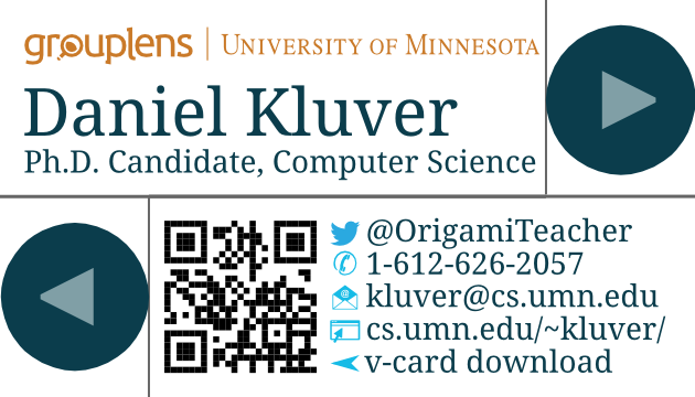
The largest difference I made to the business card was switching which side of the card I use as the "front". The side I was using before was composed of two flaps separated down the middle. It had large uninterrupted areas which made for easy layout and a very "normal" looking card. However, due to the lack of visible height/thickness differences and paper edges it was much harder to notice that this wasn't an ordinary business card. By switching which side is the front I was able to substantially increase the number of people who immediately noticed that this wasn't a normal card.
Instructional arrows
The new front side of the card provides a much more interesting surface to design due to how the front face is naturally split into more pieces by the creases and layers of paper. The most interesting part of this is that two very small regions of paper were available for content in two of the corners. These areas of paper were too small for any textual content, but were just right for a small icon. Additionally, there flaps were the perfect place to hold and pull the design to open it. Therefore I added small arrows to indicate both that the card can be manipulated, and the best place to hold the paper to perform that manipulation.
Internal Design
The 1.0 version of the interior design didn't have any overarching background and was instead laid out on a simple 2x3 grid. The switch to the new front of the design changed the shape of the unused space so that a simple grid would no longer work. This forced me to use an ultimately more interesting interior layout for the 2.x cards.
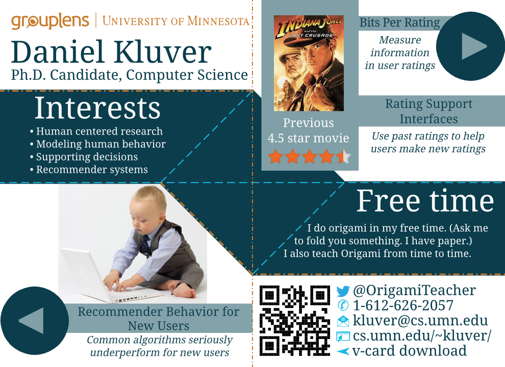
The 2.x series of the card features an attractive middle bar of color which co-insides with creases on the paper for a nice visual effect. The middle bar serves as an area in which two small blocks of text can be put and creates two alcoves that can contain picture of text content.
The 2.0 design in particular used three of the four regions for written, sentence structured text including a full title and author listing of papers from my thesis work. Consequentially, the 2.0 design was also less picture driven than the current design.
Evaluation
I like to boast that I am the only person I know who did an eye tracking study on their business card. That is a bit of an exaggeration, but as far as outcomes go, its not far from the truth.
To evaluate the design I did a small usability study using an ad-hoc methodology, and a small convenience sample. In other words I printed off draft versions of the card, folded them, and handed them to my labmates to see what they would do.
Every one of my labmates knew that the artifact was origami and went to work unfolding it. Most were also able to unfold it without support. This isn't surprising since most of my lab knows that I do origami and some had seen the 1.0 card before. Once they had opened it, if they looked confused I would prompt them to read or look over the card content (there will be a quiz in the end!) I then asked them a series of questions about the content. All subjects surveyed liked the overall layout and color choices. The biggest criticism was that there was too much text. Thanks to my colleague Vikas Kumar for pointing that out and helping me cut text until we ended up with the much improved 2.1 layout.
Interestingly, most subjects were unable to recall any information that was presented in the upper right quadrant of the card. From this I concluded that the way the pictures and visual elements of the card attracted attention most viewers were navigating down then to the right and never noticed the upper right content. Along with the "too much text" observation, this "eye path" observation (hence the eye tracking joke) motivated a substantial re-design of the interior. To deal with the attention issue I used the cover art from Indiana Jones and the last crusade. Not only was it an acceptable picture to anchor my work around movie rating interfaces, but I also found that Harrison Ford does a great job of attracting attention to the previously dead corner of the card.
What worked well
Having taken this card to two conferences I would say that I achieved most of my goals with this design. Almost everyone I handed the card to was able to immediately notice that the card could be opened, and many were able to open it without instructions. Those few who happened across the card before talking with me at depth seemed more interested and/or knowledgeable about my work for having engaged with the card. This last observation includes the man at the print shop who had some very interesting questions about movie recommendation for me when I went to pick up the cards.
Most importantly, I feel that I accomplished my impact goal. People commented that this was a cool card. Someone told their friend to make sure they get one, and almost everyone looked authentically interested in the design and what it can do. Several people went as far as to say I should go into business making this type of card for people on Etsy.
What didn't work
My biggest complaint about the current version so far is that people still seem to have difficulty opening the card. For reference, the "correct" answer is to first pinch the two arrows (one in each hand) between the thumb and forefinger, and then to pull the card open from these two corners. Unfortunately, most people grabbed the card by the top left or bottom right flaps so they can attempt to unfold the opposite flap. This design unfolds and re-folds as a whole unit meaning that it is impossible to partially unfold it. The card must be folded and unfolded in one step, and pinching any of the flaps will actually prevent the process of unfolding cleanly. So in regards to the "people can open the card" design goal, I would call 2.1 a failure.
Suggestions for improvement
Not surprisingly, when discussing this issue at conferences full of design and user experience professionals I heard a lot of good idea about how to resolve this issue. Listed below are my current favorite ideas:
- Change the arrow icons to thumb or fingerprint icons - To indicate "put your fingers here".
- Relocate the arrows to top left and bottom right - Its possible that people just have a pattern about where they put their hands on these sorts of things. If we can align with that pattern we can reduce problems.
- Add texture to the arrows - People are used to "grab-able things" having texture. Perhaps a visual and tactile texture might direct people's attention to holding on these two points.
Overall I'm pretty happy with the 2.1 design. When I have new research to discuss Or a new affiliation to endorse Ill probably do a quick re-design, call it a 3.0 card and see if I can't fix the unfolding issue. Have any thoughts about the 2.1 design? Let me know by email or twitter.