Multivariate Data Visualization
Many applications in science and engineering require the integrated understanding of multiple variables defined over a common domain. My students and I have developed a disparate set of techniques that aim to effectively convey an intuitive understanding of multiple co-located scalar- and vector- valued datasets.
|
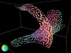
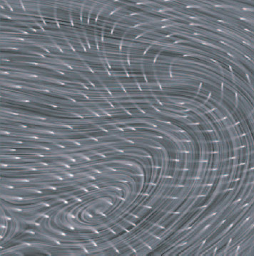
Multivariate Visualization of 3D Turbulent Flow Data, Shengwen Wang, Victoria Interrante and Ellen Longmire (2010) Visualization and Data Analysis 2010, pp. 243-254.
[PDF]
[abstract]
|
Turbulent flows play a critical role in many fields, yet our understanding of the fundamental physics of turbulence remains in its infancy. One of the long term goals in turbulence research is to develop an improved understanding of the dynamic evolution, interaction and organization of vortices in three-dimensional turbulent flow. However this task is complicated by the lack of a clear, mathematically precise definition of what a vortex is. We believe that the design of effective methods for vortex identification and segmentation in complicated turbulent flows can be facilitated by the clear, detailed visual presentation of the multiple scalar and vector quantities potentially relevant to the feature identification process. In this paper, we present several different methods aimed at facilitating the integrated understanding of a variety of local measures extracted from 3D multivariate flow data, including quantities, directions, and orientation. A key focus of our work is on the development of methods for illustrating the local relationships between scalar and vector values important to the vortex identification process such as vorticity, swirl, and velocity, along with their direction and magnitude. Our methods include the use of arrows and glyphs or 3D texture along with different color coding strategies. We demonstrate our methods on a range of data including 3D turbulent boundary flow data and time varying ring data. The variety of multi-variate visualization methods that we have developed has succeeded in supporting fluids researchers in their efforts to gain deeper insights into their data.
|
Streamline Visualization of Multiple 2D Vector Fields, Timothy Urness and Victoria Interrante (2008) Visualization and Data Analysis: Proceedings of the SPIE,Volume 6809, article id. 680909, 11 pp.
[PDF]
[abstract]
|
The analysis of data that consists of multiple vector fields can be greatly facilitated by the simultaneous visualization of the vector fields. An effective visualization must accurately reflect the key physical structures of the fields in a way that does not allow for an unintended bias toward one distribution. While there are several effective techniques to visualize a single vector field through equally-spaced streamlines, applying these techniques to individual vector fields and combining them in a single image yields undesirable artifacts. In this paper, we present strategies for the effective visualization of two vector fields through the use of streamlines.
|
FieldVis: A Tool for Visualizing Astrophysical Magnetohydrodynamic Flow, Blayne Field, Sean O'Neill, Timothy Urness, Victoria Interrante and Thomas W. Jones (2007) IEEE Computer Graphics and Applications, 27(1), pp. 9-13.
[PDF]
[abstract]
|
Our group is involved in magnetohydrodynamic simulations that track the time and space evolution of the full 3D velocity and magnetic vector fields, plus fundamental scalar fields such as density and pressure. To accomplish the complex visualization of these jets, we developed FieldVis, a simulation tool that focuses primarily on representing 3D vector and scalar fields. Examining data from a sample 3D magnetohydrodynamic fluid simulation graphically illustrates the usefulness of our visualization package.
|
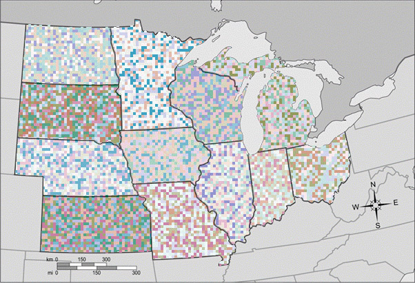
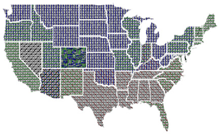
Weaving versus Blending: A Quantitative Assessment of the Information Carrying Capacities of Two Alternative Methods for Conveying Multivariate Data with Color, Haleh Hagh-Shenas, Sunghee Kim, Victoria Interrante and Christopher Healey (2007) IEEE Transactions on Visualization and Computer Graphics, 13(8), October 2007, pp. 1270-1277.
[PDF]
[abstract]
|
In many applications, it is important to understand the individual values of, and relationships between, multiple related scalar variables defined across a common domain. Several approaches have been proposed for representing data in these situations. In this paper we focus on strategies for the visualization of multivariate data that rely on color mixing. In particular, through a series of controlled observer experiments, we seek to establish a fundamental understanding of the information-carrying capacities of two alternative methods for encoding multivariate information using color: color blending and color weaving.
We begin with a baseline experiment in which we assess participants' abilities to accurately read numerical data encoded in six different basic color scales defined in the L*a*b* color space. We then assess participants' abilities to read combinations of 2, 3, 4 and 6 different data values represented in a common region of the domain, encoded using either color blending or color weaving. In color blending a single mixed color is formed via linear combination of the individual values in L*a*b* space, and in color weaving the original individual colors are displayed side-by-side in a high frequency texture that fills the region. A third experiment was conducted to clarify some of the trends regarding the color contrast and its effect on the magnitude of the error that was observed in the second experiment.
The results indicate that when the component colors are represented side-by-side in a high frequency texture, most participants' abilities to infer the values of individual components are significantly improved, relative to when the colors are blended. Participants' performance was significantly better with color weaving particularly when more than 2 colors were used, and even when the individual colors subtended only 3 minutes of visual angle in the texture. However, the information-carrying capacity of the color weaving approach has its limits. We found that participants' abilities to accurately interpret each of the individual components in a high frequency color texture typically falls off as the number of components increases from 4 to 6. We found no significant advantages, in either color blending or color weaving, to using color scales based on component hues that are more widely separated in the L*a*b* color space. Furthermore, we found some indications that extra difficulties may arise when opponent hues are employed.
|
Strategies for the Visualization of Multiple 2D Vector Fields, Tim Urness, Victoria Interrante, Ellen Longmire, Ivan Marusic, Sean O'Neill and Thomas W. Jones (2006) IEEE Computer Graphics and Applications, 26(4), pp. 74-82.
[PDF]
[abstract]
|
Our research explores strategies for developing effective methods for the visual representation of multiple colocated vector and scalar fields to allow understanding and analyses of each field, both individually and in the context of the other.
|
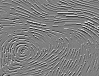
Directional Enhancement in Texture-based Vector Field Visualization, Francesca Taponecco, Timothy Urness and Victoria Interrante (2006) GRAPHITE 2006, (the 4th International Conference on Computer Graphics and Interactive Techniques in Australia and South-East Asia), pp. 197-204.
[PDF]
[abstract]
|
The use of textures provides a rich and diverse set of possibilities for the visualization of flow data. In this paper, we present methods designed to produce oriented and controlled textures that accurately reflect the complex patterns that occur in vector field visualizations. We offer new insights based on the specification and classification of neighborhood models for synthesizing a texture that accurately depicts a vector field. Secondly, we introduce a computationally efficient method of texture mapping streamlines utilizing outlining textures to depict flow orientation.
|
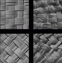
A Closer Look at Texture Metrics for Visualization, Haleh H. Shenas, Victoria Interrante and Cheong-Hee Park (2006) Human Vision and Electronic Imaging XI, SPIE 6057, pp. 321-331.
[PDF]
[abstract]
|
This paper presents some insights into perceptual metrics for texture pattern categorization. An increasing number of researchers in the field of visualization are trying to exploit texture patterns to overcome the innate limitations of three dimensional color spaces. However, a comprehensive understanding of the most important features by which people group textures is essential for effective texture utilization in visualization. There have been a number of studies aiming at finding the perceptual dimensions of the texture. However, in order to use texture for multivariate visualization we need to first realize the circumstances under which each of these classification holds. In this paper we discuss the results of our three recent studies intended to gain greater insight into perceptual texture metrics. The first and second experiments investigate the role that orientation, scale and contrast play in characterizing a texture pattern. The third experiment is designed to understand the perceptual rules people utilize in arranging texture patterns based on the perceived directionality. Finally, in our last section we present our current effort in designing a computational method which orders the input textures based on directionality and explain its correlation with the human study.
|
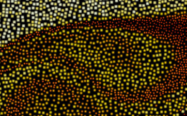
Pointillist and Glyph-Based Visualization of Nanoparticles in Formation, P. Coleman Saunders, Victoria Interrante and Sean C. Garrick (2005) Joint Eurographics/IEEE Symposium on Visualization, pp. 169-176.
[PDF]
[abstract]
|
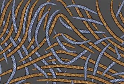
In this paper we offer new, texture-based methods for the visualization of multivariate data. These methods aim to more effectively convey the results of calculations simulating the formation of nanoparticles in tur- bulent flows. In these simulations, an entire distribution of nanoparticles is computed at every point across a two-dimensional slice of the data space, for every time step. Previous visualization methods have relied on multiple separate images to convey summary statistics about the datasets, including mean diameter and stan- dard deviation of particle sizes. We introduce new methods based on texture which aim to enable the integrated understanding of the entire distribution of values at each point across the domain in terms of both summary statistics at each point and particle counts for various sizes of particles. Pointillism is used to represent the data at each point across the data range as a high-resolution texture. Circular glyphs can also be used to form a more discrete, spot-based texture, in which different characteristics of the distribution are encoded in various features of the spots.
|
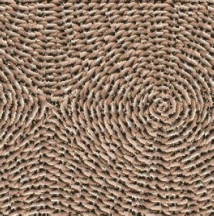
Compositing Color with Texture for Multi-Variate Visualization, Haleh H. Shenas and Victoria Interrante (2005) GRAPHITE 2005 (the 3rd International Conference on Computer Graphics and Interactive Techniques in Australia and South-East Asia), pp. 443-446.
[PDF]
[abstract]
|
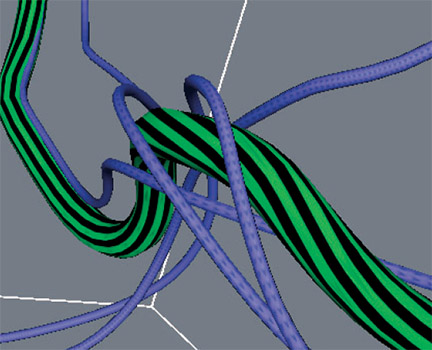
Multivariate data visualization requires the development of effective techniques for simultaneously conveying multiple different data distributions over a common domain. Although it is easy to successfully use color to represent the value of a single variable at a given location, effectively using color to represent the values of multiple variables at the same point at the same time is a trickier business. In this paper, we provide a comprehensive overview of strategies for effectively combining color with texture to represent multiple values at a single spatial location, and present a new technique for automatically interweaving multiple colors through the structure of an acquired texture pattern.
|
Techniques for Visualizing Multi-valued Flow Data, Tim Urness, Victoria Interrante, Ellen Longmire, Ivan Marusic and Bharathram Ganapathisubramani (2004) Joint Eurographics/IEEE Symposium on Visualization, pp. 165-172.
[PDF]
[abstract]
|
In this paper we discuss several techniques to display multiple scalar distributions within an image depicting a 2D flow field. We first address how internal contrast and mean luminance can effectively be used to represent a scalar distribution in addition to an underlying flow field. Secondly, we expand upon a current technique to more effectively use luminance ramps over dense streamlines to represent direction of flow. Lastly, we present a new method, based on embossing, to encode the out-of-plane component of a 3D vector field defined over a 2D domain. Throughout this paper, we limit our focus to the visualization of steady flows.
|
Effectively Visualizing Multi-Valued Flow Data Using Color and Texture, Tim Urness, Victoria Interrante, Ivan Marusic, Ellen Longmire and Bharathram Ganapathisubramani (2003) IEEE Visualization, pp. 115-121.
[PDF]
[abstract]
|
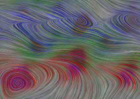
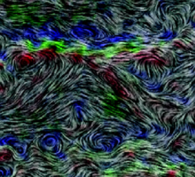
In this paper we offer several new insights and techniques for effectively using color and texture to simultaneously convey information about multiple 2D scalar and vector distributions, in a way that facilitates allowing each distribution to be understood both individually and in the context of one or more of the other distributions. Specifically, we introduce the concepts of: a) 'color weaving' for simultaneously representing information about multiple co-located color encoded distributions, and b) 'texture stitching' for achieving more spatially accurate multi- frequency line integral convolution representations of combined scalar and vector distributions. The target application for our research is the definition, detection and visualization of regions of interest in a turbulent boundary layer flow at moderate Reynolds number. In this work, we examine and analyze streamwise-spanwise planes of three- component velocity vectors with the goal of identifying and characterizing spatially organized packets of hairpin vortices.
|
Effective Visualization of Stereo Particle Image Velocimetry Vector Fields of a Turbulent Boundary Layer, Ellen K. Longmire, Bharathram Ganapathisubramani, Ivan Marusic, Tim Urness and Victoria Interrante (2003) Journal of Turbulence, 4(2003) 023.
[PDF]
[animations]
[abstract]
|
Stereo particle image velocimetry datasets contain three-dimensional information over a plane, from which multiple quantities can be derived at each point. The task of visualizing these different parameters simultaneously is challenging, and this inhibits our ability to analyse and derive firm conclusions about the physics of the flow. Currently, the common approach is to view each parameter separately in different images. Such an approach is very inefficient, especially for large fields of view where many important structures and features co-exist. In this paper we discuss several ways in which the primary quantities can be viewed simultaneously in the same image. The simplest method is to use different colours for each parameter and to overlay all the different colours on one image. The limitations of such an approach will be described. Other methods considered involve using texture generated from a line integral convolution algorithm to convey instantaneous velocity direction and magnitude. Animated texture is also described, together with variants involving combined colour and out-of-plane height. The use of height in tandem with colour and animated texture is a useful method in distinguishing the different parameters in the regions of overlap.
|
Harnessing Rich Natural Textures for Multivariate Visualization, Victoria Interrante (2000) IEEE Computer Graphics and Applications, 20(6), pp. 6-11.
[PDF]
[abstract]
|
The intricate variety and subtle richness of detail of texture patterns found in nature support possibilities for data representation far more vast and comprehensive than we could ordinarily hope to achieve from standard primitives. I seek a partially ordered multidimensional palette of richly detailed and varying texture patterns that can be used - in conjunction with lightness and hue - to represent multivariate information. The goal is to facilitate the flexible visual appreciation of the correlations of various quantities across the different dimensions.